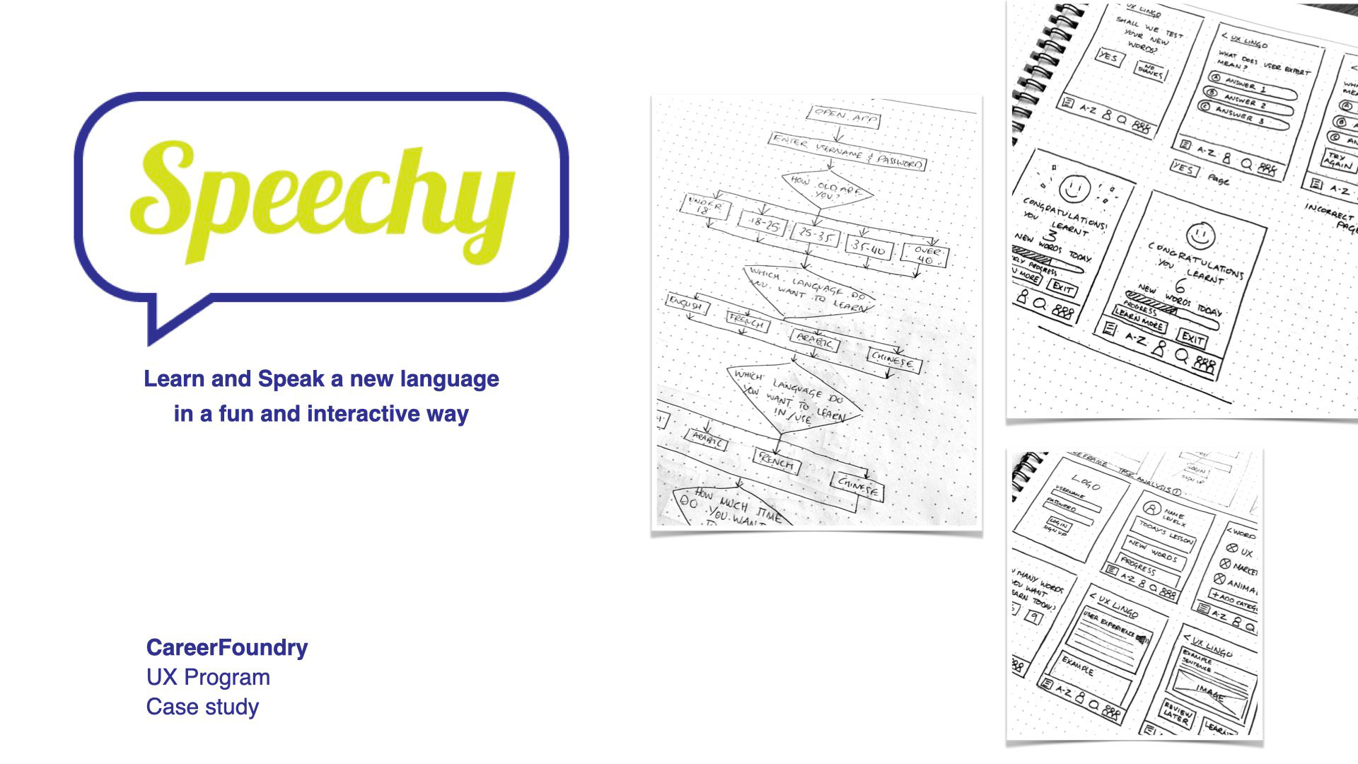
Overview
Speechy is a language learning mobile app that allows users to learn a new language quickly in a fun, engaging and interactive way, keeping them interested and entertained.
Purpose and Context
The aim of the project was to create a researched and tested mobile app design using the design thinking process and to demonstrate my UX design skills as part of my UX Immersion program at CareerFoundry.
Objective
Research reveals that users believe the best way to learn a new language is by learning and practicing. The problem they face while using a language learning app is that it does not have a well-thought-out lesson structure nor does it offer an interactive learning style.
As a result, users do not feel they are learning quickly and thus not seeing any progress. Consequently, they abandon the app and entirely dismiss the idea of learning a new language using an app.
Problem Statement
Users need a way to learn a new language in a concise, interactive and structured way that is also enjoyable because they want to be able to start speaking the language quickly as they learn.
We will know this to be true when users complete their language programs and are able to speak the language successfully.
Role
UX Designer
Project Scale
3 weeks
Tools Used
Adobe XD
Invision
Zoom
Paper and pen
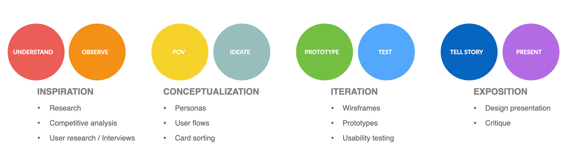
The process
I used the design thinking methodology as it is a human-centered approach keeping users needs and
pain-points in mind.
pain-points in mind.
Competitive Analysis
It was important to research and try out a few other language and vocabulary apps to help me understand the space and explore what they are offering. Also, I wanted to recognize any missing gaps which I can improve upon and identify unmet user needs which can be introduced in my app to give it a competitive edge.
I focused on the positives and negatives for each app and took away some learning points. Some notable features were to give users the flexibility to personalize their learning experiences, offer a progressive learning experience and provide some form of motivation to follow through.
The next step was to conduct user interviews to get first-hand information and see if their needs matched some of the features I had explored in the other apps and how can they be improved upon.
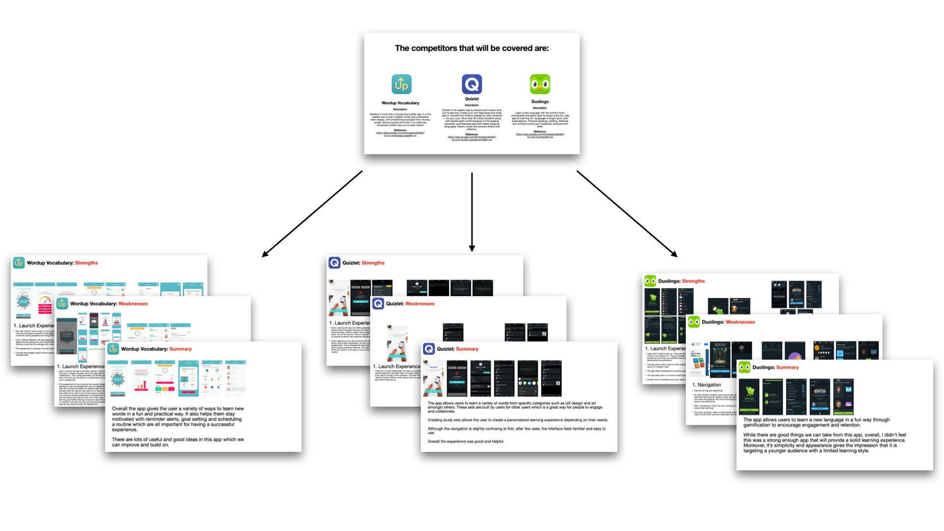
Competitive analysis was conducted for 3 different language and vocabulary apps
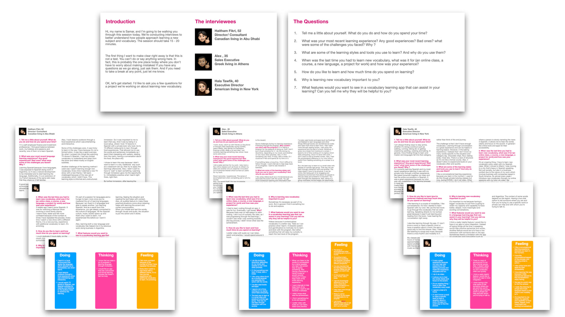
User Research
To better understand my user's needs and pain-points, I interviewed 3 participants who were either currently learning a new language or had done so in the past.
The questions were structured around understanding user attitudes and behaviour towards learning languages, determining which tasks they would like to complete using the app and collecting data on the context in which they would use a language learning app.
Due to the current COVID-19 global pandemic and different geographical locations, the interviews were conducted over Zoom and were approximately 30 minutes each.
From this research I was able to identify a common theme amongst all users. None of them felt that language apps offered well-structured lessons and thus making it an unreliable way to learn languages.
Their responses were sorted into 3 categories: doing, thinking and feeling which helped inform and shape my personas in the next step.
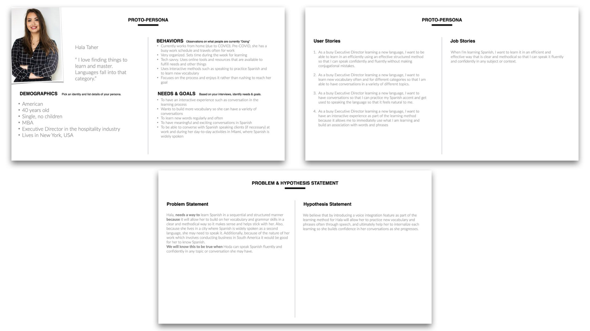
User Persona Creation
After synthesizing the data, I created proto-personas. This helped me humanize my users, their needs and problems and craft user stories, problems statements and hypotheses which ultimately informed the features of my app.
Some user needs which were identified were: the ability to speak confidently and fluently, learning in an interactive way and learning new vocabulary on the go with the right accent.
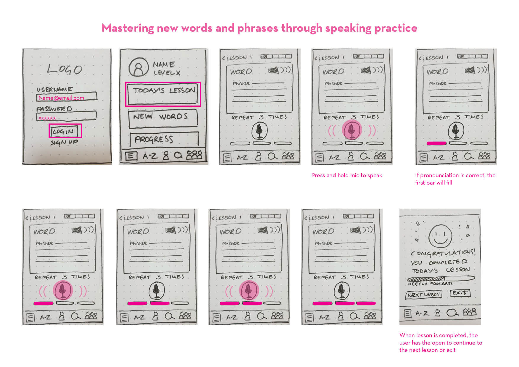
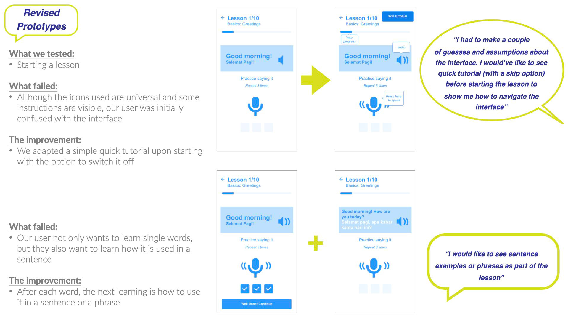
One of the decisions I took to solve this problem was to include a speech feature that allows users to practice saying words as they learn. This was an innovative idea which other apps didn't have.
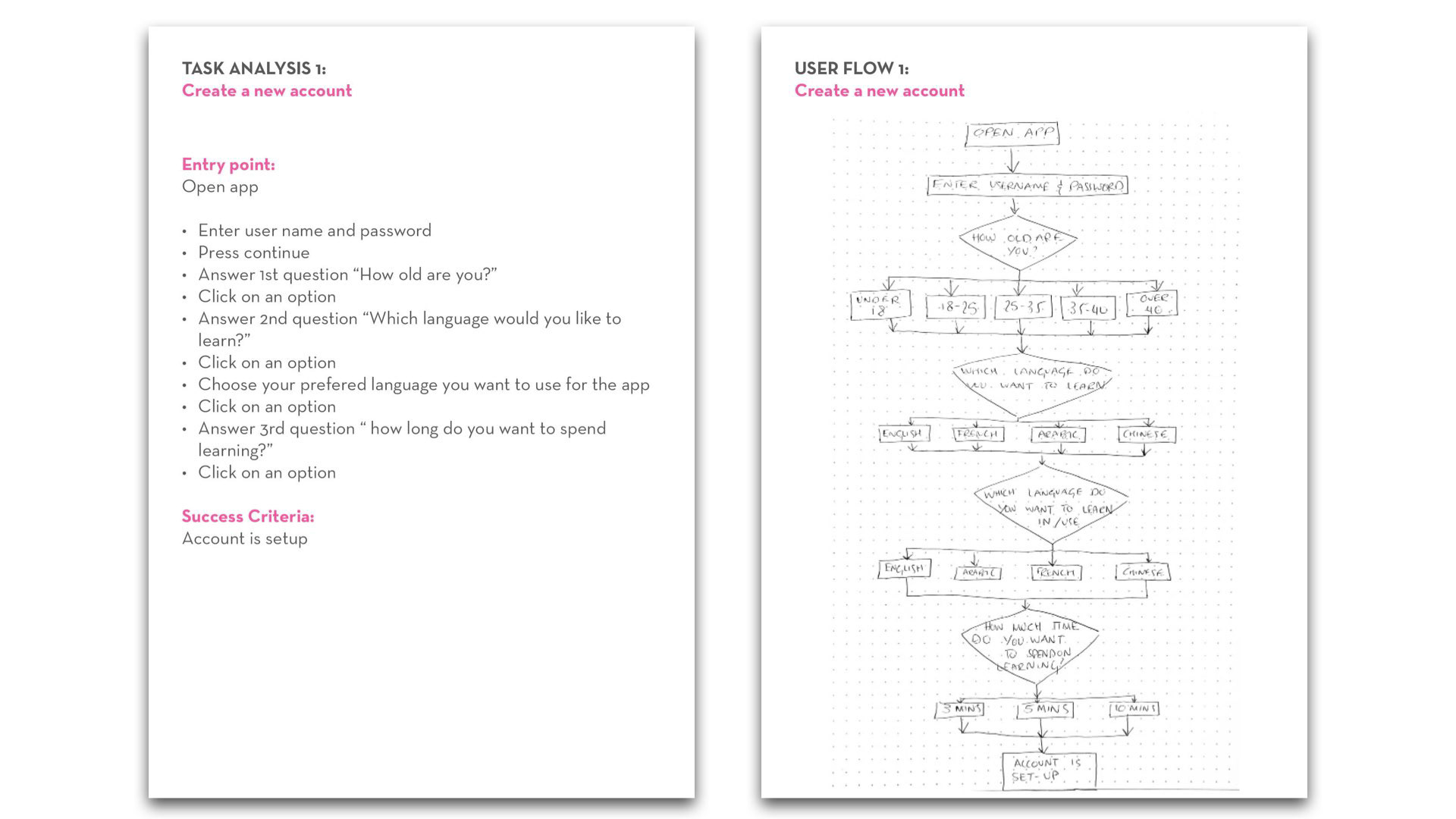
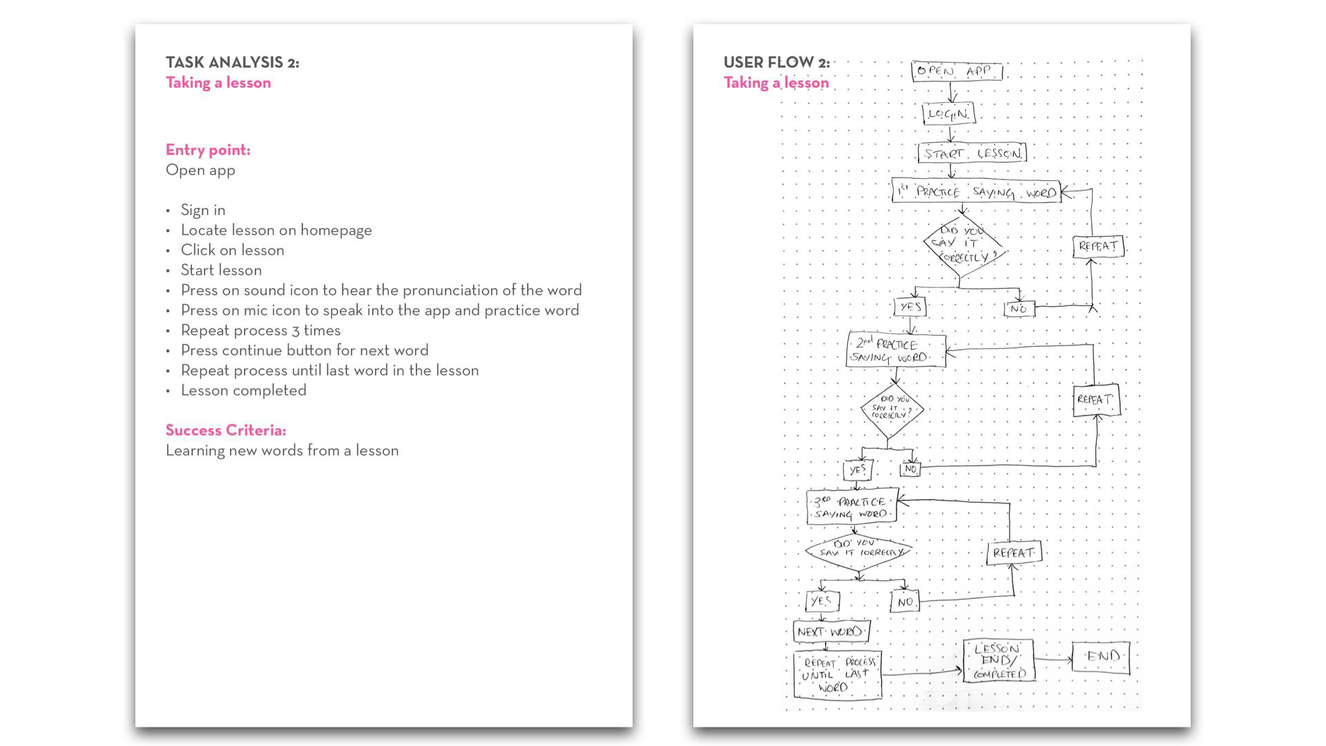
Information Architecture
From my research I was able to identify a list of tasks a user will need to complete in order to achieve their desired goals. User flows were mapped out to segment and define the user experience.
Wireframing & Prototyping
To quickly explore ideas and visualize the user flows, I began sketching low-fidelity wireframes using pen and paper before turning them into mid-fidelity prototypes.
My focus was to include the speech feature as part of the learning experience so it was important to see how this feature can be incorporated within the interface.
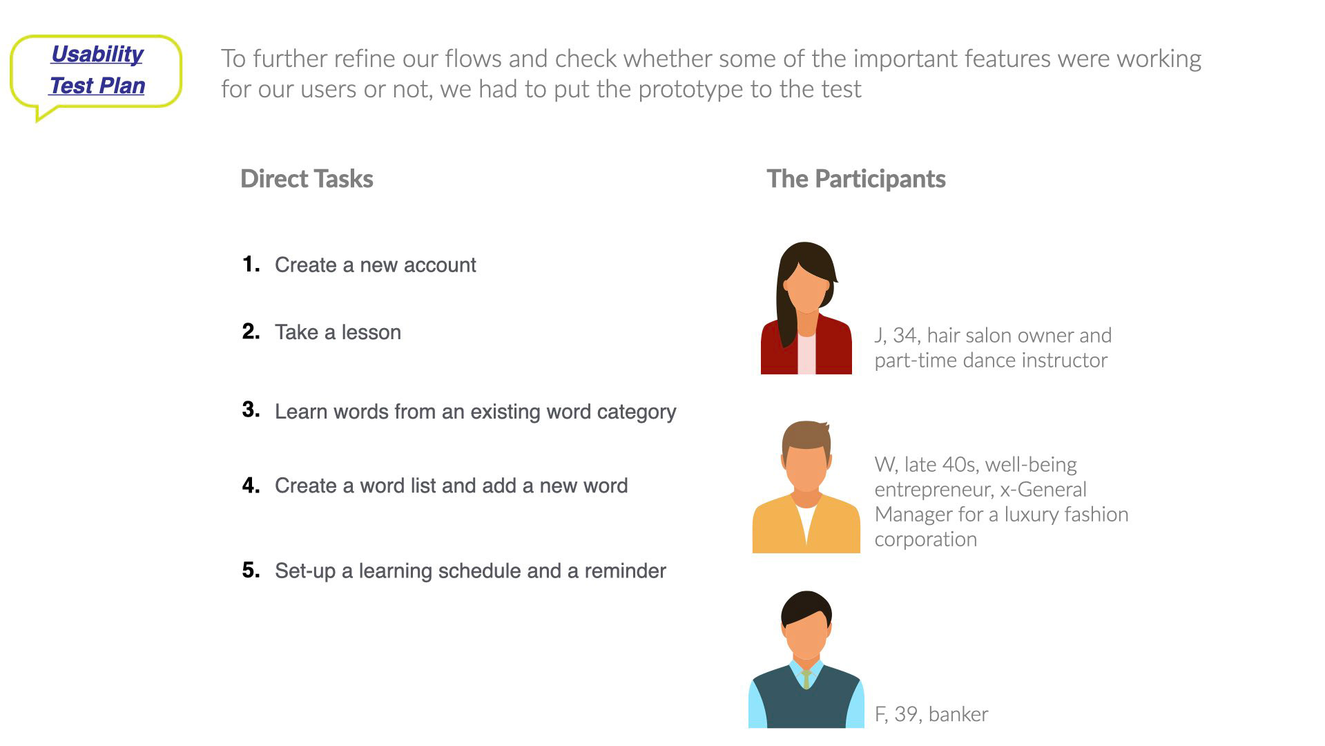
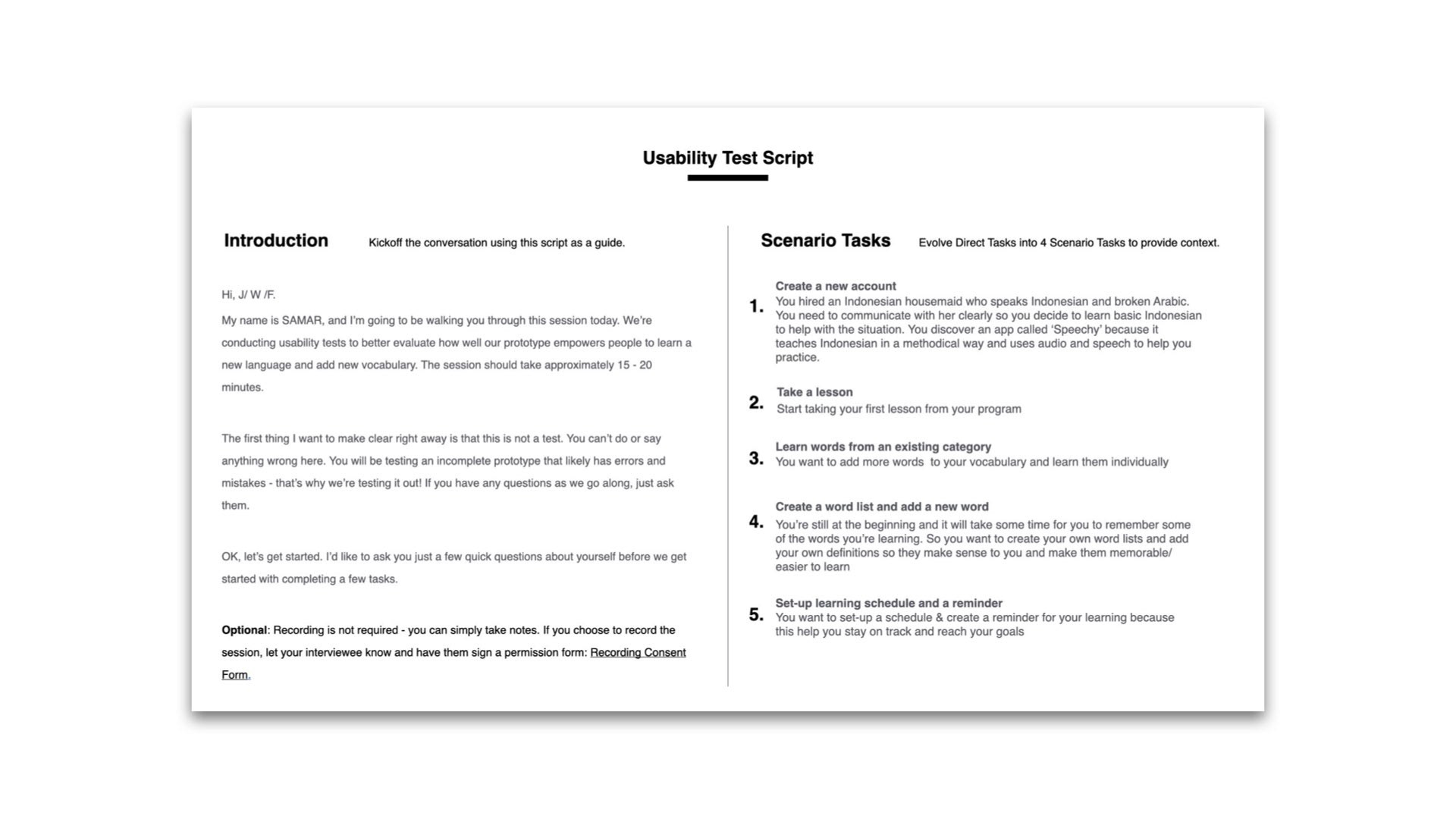
User Testing
To validate my designs, a mid-fidelity prototype was created and tested with 3 new participants who represented my target user profile. The testing was conducted via Zoom using a clickable prototype where each user was asked to complete 5 specific tasks that would test the success of the apps main features.
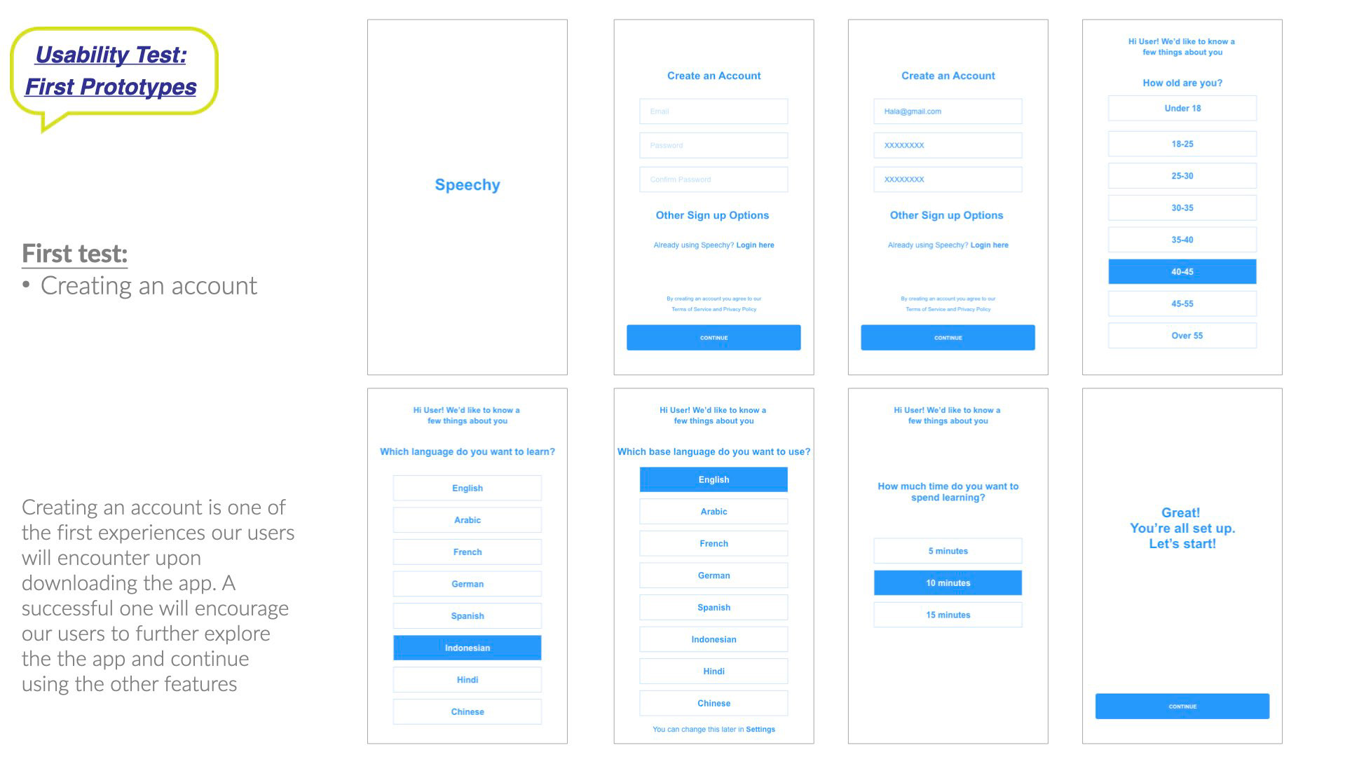
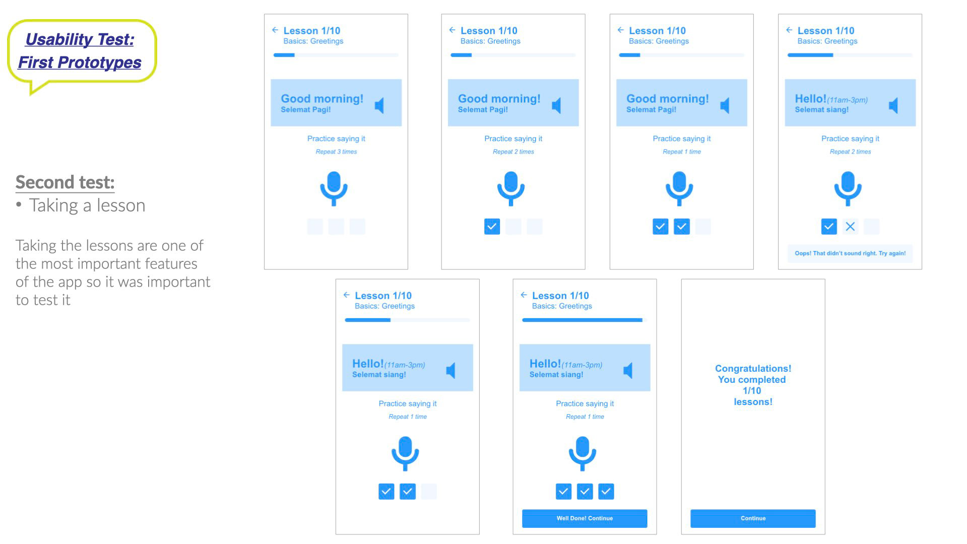
Mid-fidelity prototypes were tested
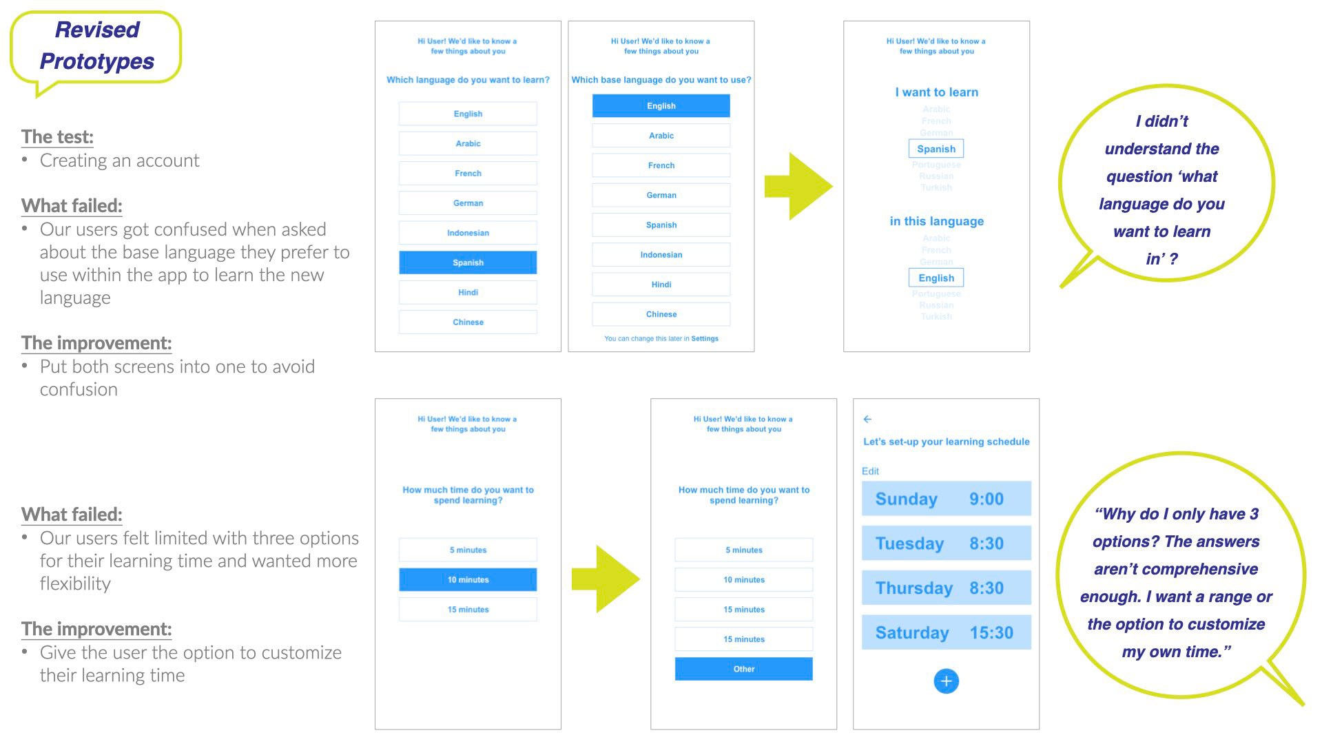
A usability test report was generated whereby errors were identified and practical solutions were recommended to help improve the design.
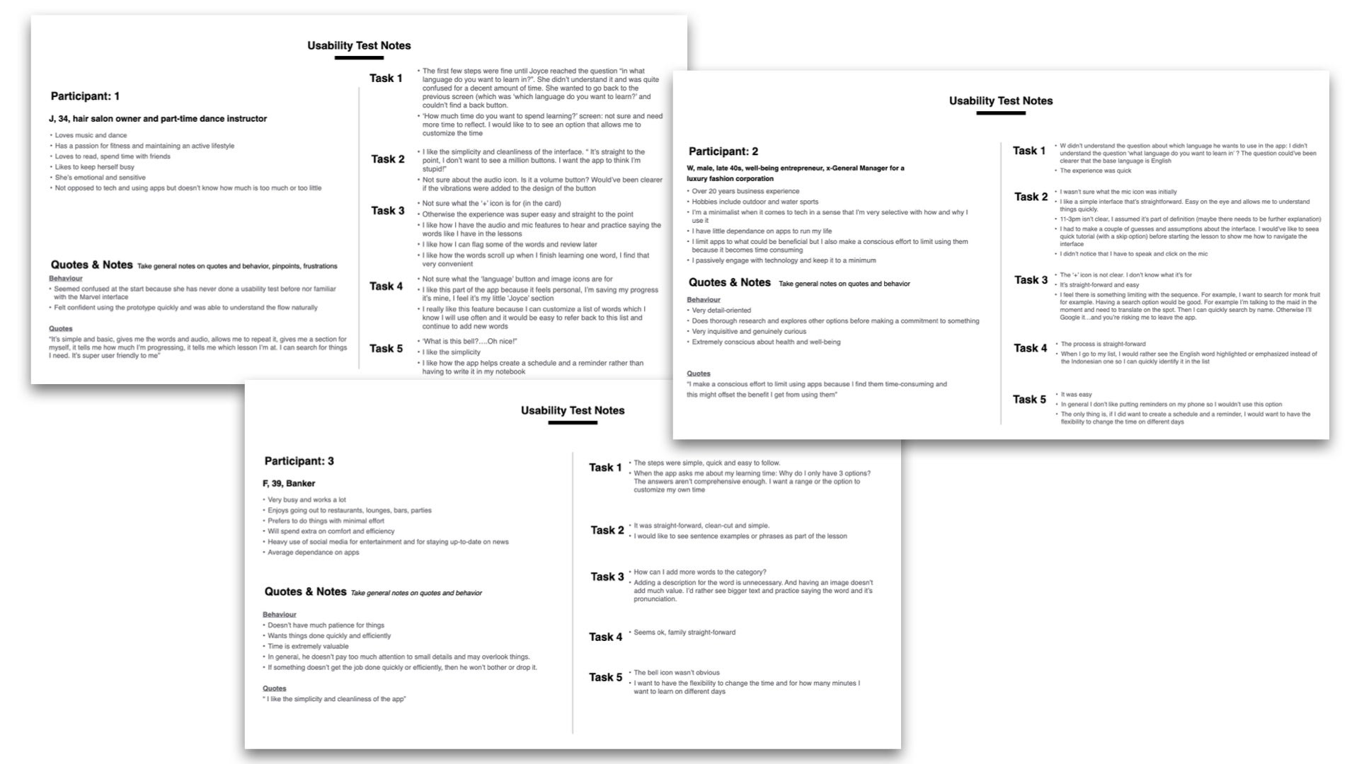
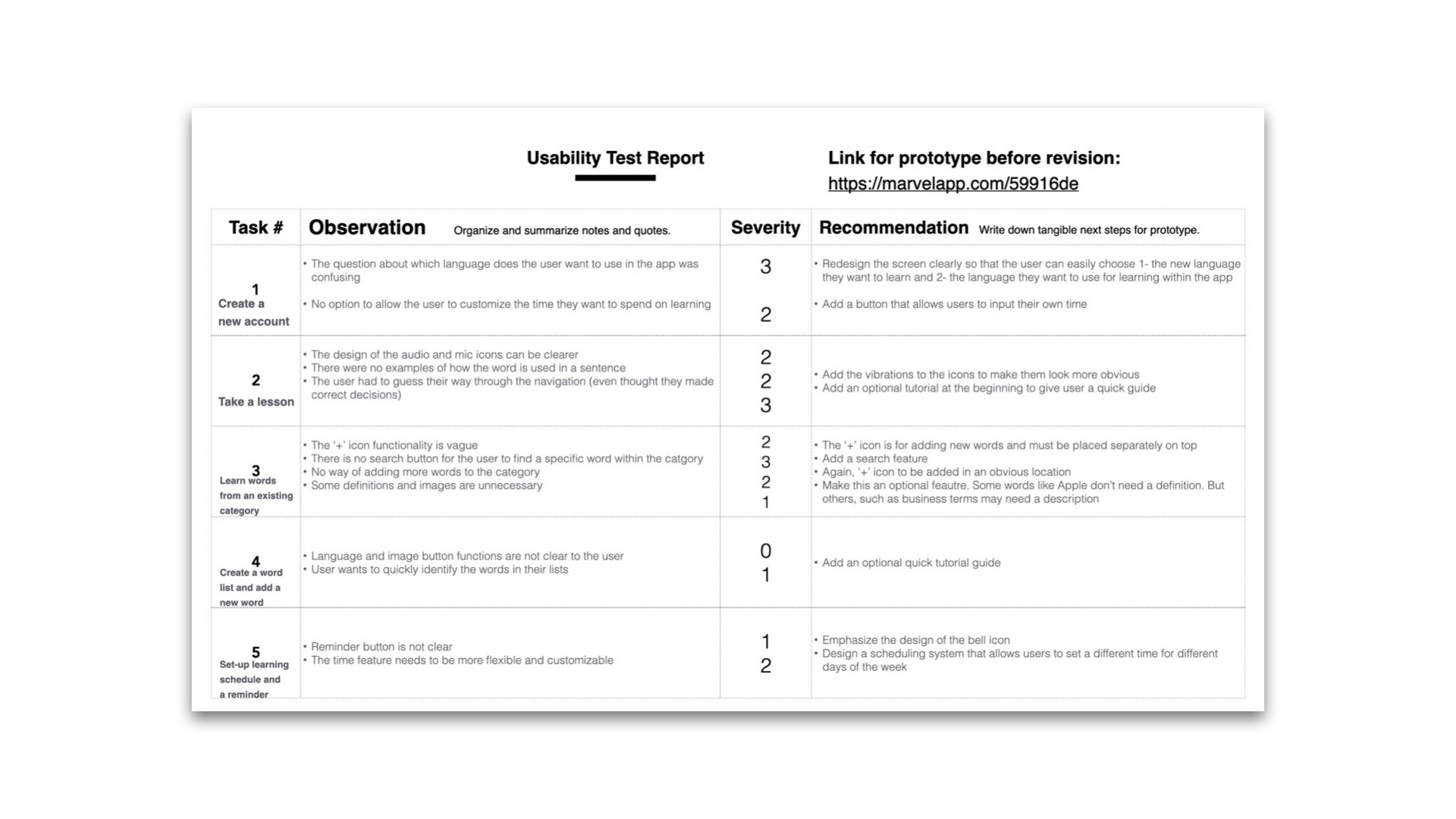
The prototype was revised before moving forward with the high-fidelity designs.
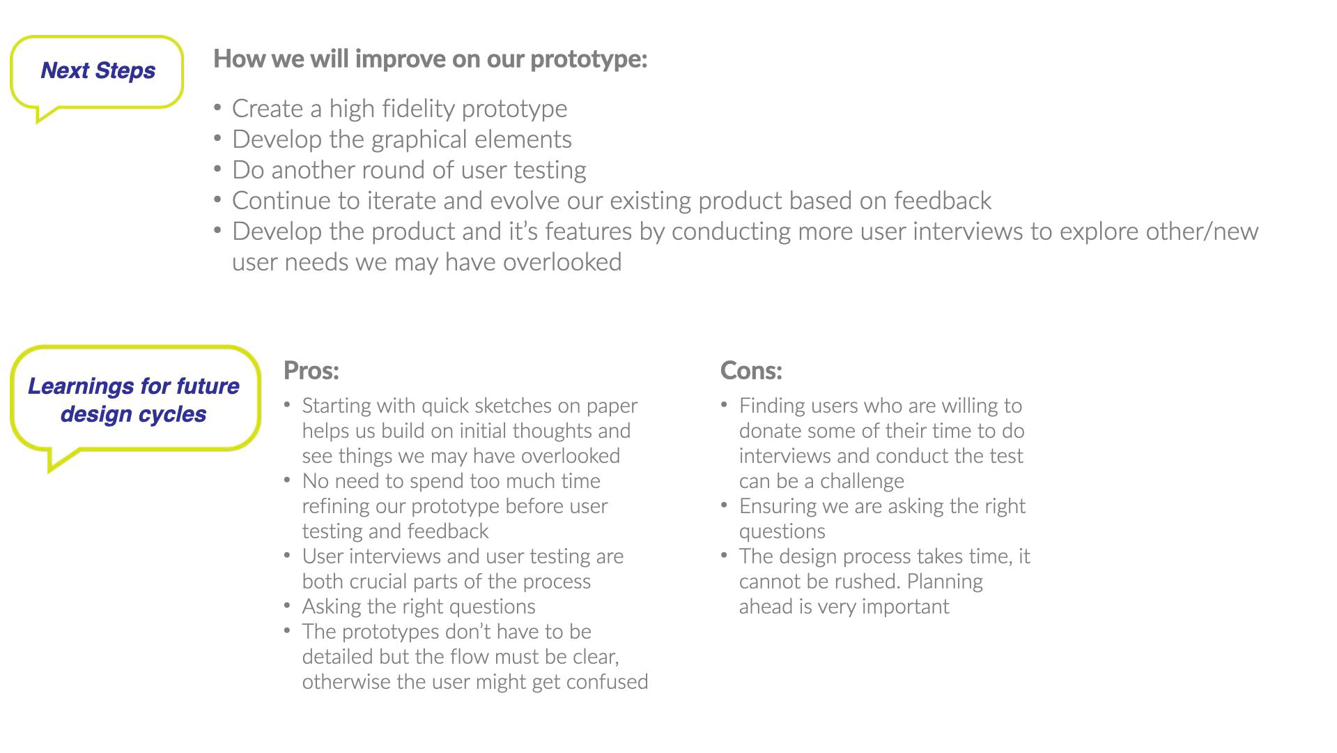
Next Steps and Learnings
You can view the mid-fidelity prototype for Speechy here